







A single onboarding flow, eight different ways
Good UX depends on consistency: when similar tasks look and behave the same way, people form one mental model and reuse it, which lowers cognitive load, prevents errors, and builds confidence. For years, our Source Code Management onboarding broke that rule. Each time we added a new source code manager, we built its flow around that platform, and each one ended up with its own steps, terminology, and layout. A customer who had connected GitHub had to start from scratch with GitLab, right when they were forming their first impression of Endor Labs. So, we started over. Today every SCM shares a single flow for onboarding and editing, with the same steps, language, and structure wherever your code lives
The research
In a fast-moving startup, every feedback channel is a source of product insight. To understand where the integration experience was breaking down, we gathered signals from across the customer journey:
- Support tickets & CS notes: Reviewed six months of customer feedback and organized recurring complaints into clear themes.
- Shadowed sales calls: Observed demos to identify moments of hesitation, confusion, and the points where engineers had to leave the product and reference documentation.
- Experience every existing onboarding flow: Completed every onboarding flow from a new customer's perspective across each supported Git provider
- Technical deep dives: Analyzed which constraints were real backend limits and which were artifacts of how the screens were built.
The insights
- Scans started late. Users had to touch every configuration option instead of relying on smart defaults. There were 9 clicks of data entered by users.
- Results arrived late because scans started late.
- Users lost track of their code. Lack of clarity around scan status and automatic creation of namespace left users confused about how to find their onboarded projects.
- Developers got notifications they never asked for. Notifications turned on by default created noise for users like for full reachability PR scans.
- Each SCM had its own rules. For the many customers who use more than one SCM, the flows were so different that connecting a second provider felt like using a different product.
- Time to value too long. Customers waited too long to see what Endor Labs can do.
Need for a streamlined onboarding
Many of our customers work with multiple source code management (SCM) providers. The problem was that connecting each one in Endor Labs UI felt different. The forms looked different, the steps were different, and users were asked for different information.
This created an inconsistent experience. Users had to learn the process again each time they connected another provider. We grouped these challenges into three primary categories to identify the most impactful opportunities for creating a more consistent onboarding experience.
1.Situational.
The reasons that are beyond Endor Labs control like customers preferring to use more than one git provider because of mergers, migration or legal reasons
2.Behavioral.
The problem was not just visual but integration flows of various git providers inherently behave differently.
3.Intentional.
In any startup, resources are finite. The goal was to identify the issues where the return on fixing them had the highest return for users
The difficult questions in pursuit of a simple solution
With the categorization of multiple issues, the main questions that came up were:
- What is the shortest flow for time to value?
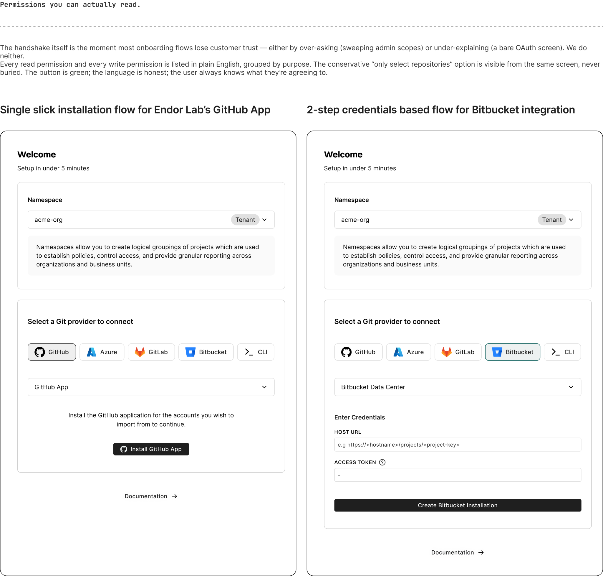
- How do we respect the principle of least privilege where we ask for lesser access and yet reach the depth required for accurate scan results, which meant more questions for users and hence more cognitive load?
- How do we design the UI of inherently different flows making users feel like they are going through a similar journey ?
The northstar principles
Any design problem, no matter how difficult it is, could be targeted from 3 perspectives. The flow, the architecture and the UI.
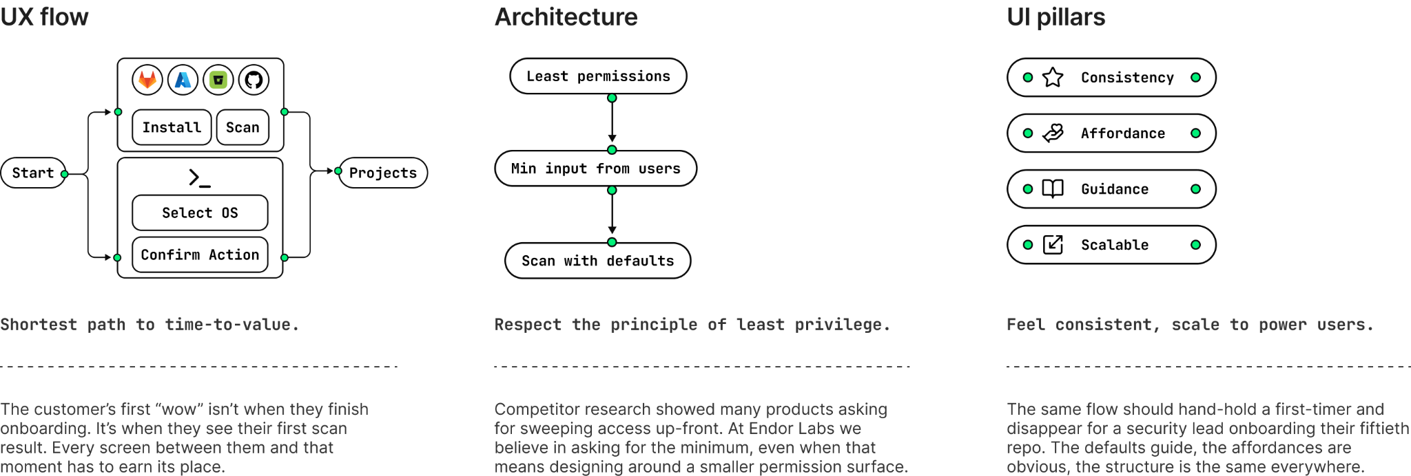
Four principles that supported our new design were:
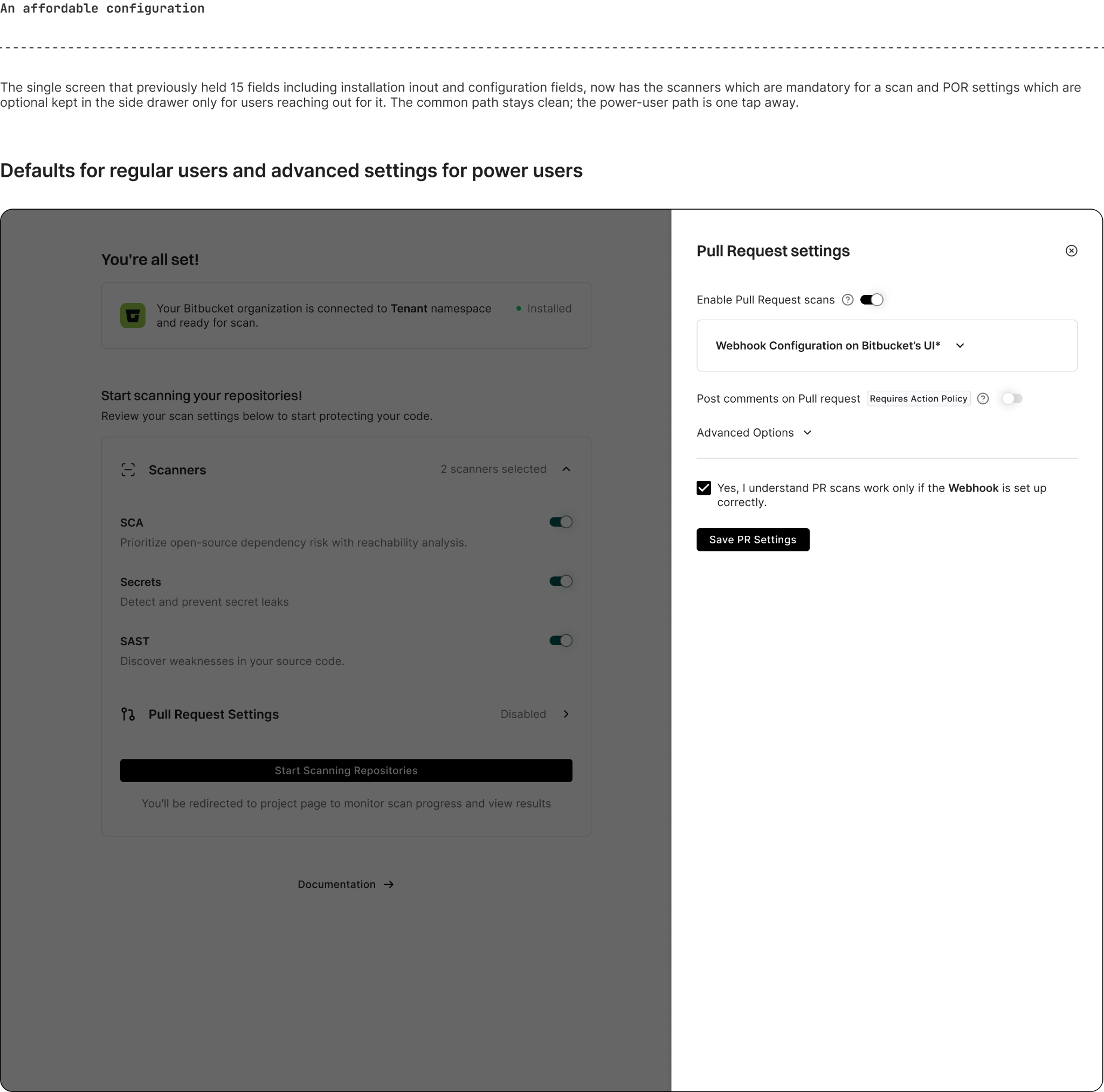
- Scan First, Configure Later. Everything doesn’t have to be accommodated on a single screen. If adding a step makes the flow simple, add it.
- Go with defaults. The solution wasn't adding more choices. It was identifying the right defaults.. This leads to less questions for users, hence lesser cognitive load
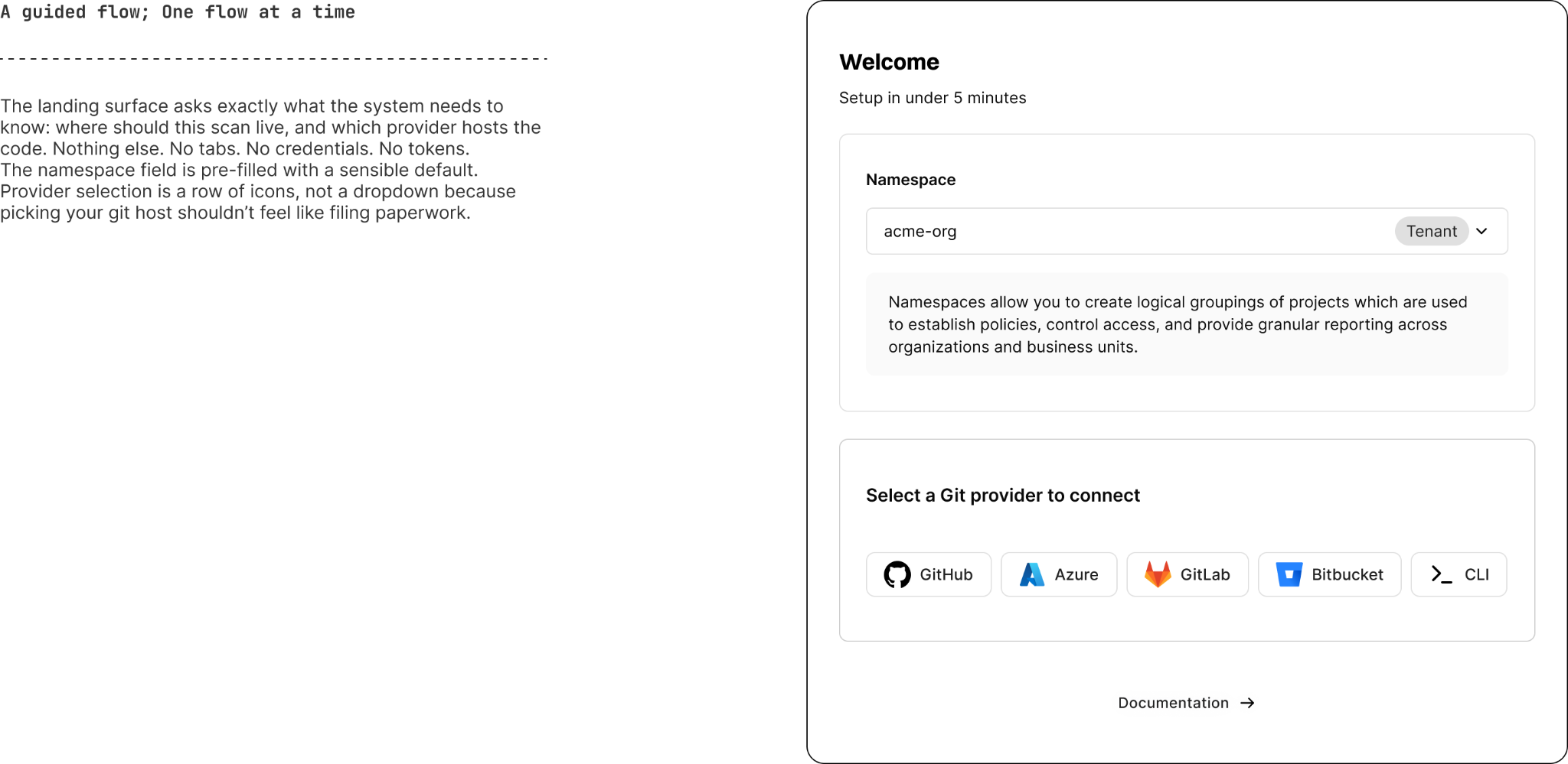
- No flows within flows. Make the path guided for users. Ask one relevant question at a time.
- Flexibility & efficiency of use. Remember that this is an enterprise product. Make the flow simple enough for regular users, yet flexible enough for power users to handle complex cases.
The Reveal
The impact
The deliverable wasn’t a Figma file of identical flows. It was a categorisation framework, understanding the patterns, respecting similarities and dissimilarities in the git providers integrations, three new design-system primitives, and a working onboarding flow without breaking the existing flows or customer’s trust.

What's next?
When you're ready to take the next step in securing your software supply chain, here are 3 ways Endor Labs can help: